
We’ll learn how to automate a PowerPoint presentation from Excel data using Python. Below picture illustrates what we’ll do in this project:
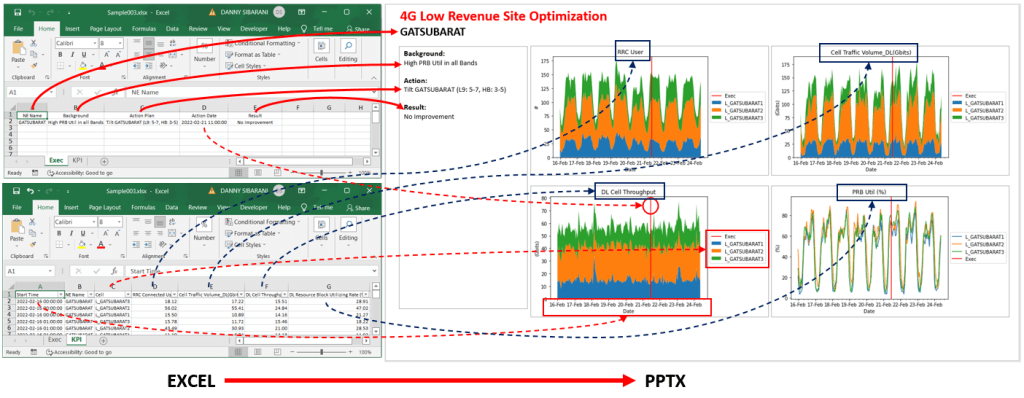
The input for this project is an excel file with 2 sheets:
- First sheet name: KPI, that have 7 columns {Start Time, NE Name, Cell, RRC Connected User, Cell Traffic Volume DL(Gbits), DL Cell Throughput, and DL Resource Block Utilizing Rate (%)}. ‘Start Time’ column will be a data series that will be used as x-axis. ‘NE Name’ column will be used to filter only one network element per slide. ‘Cell’ will be used as a legend (data series). Other 4 columns will be used as a data series on the chart.
- Second sheet name: Exec, that have 5 columns {NE Name, Background, Action Plan, Action Date, Result}. ‘NE Name’ will be shown on the sheet header. ‘Background’, ‘Action Plan’, and ‘Result’ will be shown at left Text Box as an information. And ‘Action Date’ will be shown on every chart as a red-vertical-line to mark action that already taken at a specific date and time.
You can download the excel file mentioned above for this project, here.
Steps to complete this project:
- Load Excel File Data from KPI & Exec sheets to Pandas DataFrame
- Filter DataFrame (based on your requirement)
- Pivoting filtered DataFrame
- Create charts from Pivot data above
- Create PowerPoint presentation Slide
- Add charts, header, and left-information to the Slide
- Save PowerPoint presentation (.pptx)
For the purpose of being easy to read and reusable, we’ll try to wrap all the above steps to a class/object (CMySlide), as below:
But, before we can create CMySlide class above, we need some classes from other posts below:
- How to read excel (xls, xlsx) file in python using pandas. From this post we’ll use CReadExcel, you can copy the class to your project.
- Create a chart from Excel data in Python with matplotlib. From this post we’ll use CPivot and CChart classes, please copy the classes to your project.
- How to create PowerPoint Presentation with Python. From this post we need CPptx, CSlide, CTextBox, and CParagraph, please copy all the classes to your project.
You can copy all of the classes above to your Jupyter-notebook in one file so you don’t need to import every class to your project. So now, without wasting time, here is the class to create a PowerPoint presentation from Excel Data:
class CMySlide:
    def __init__(self, excelFilePath, kpiSheetName, execSheetName, neName):
        #Initialize Excel File to DataFrame and filter by NEName
        self.neName = neName

        kpi_excel = CReadExcel(excelFilePath, kpiSheetName)
        self.kpi = kpi_excel.dataframe[kpi_excel.dataframe['NE Name']==neName]
        self.kpi['Start Time'] = pd.to_datetime(self.kpi['Start Time'])

        exec_excel = CReadExcel(excelFilePath, execSheetName)
        self.exec = exec_excel.dataframe[exec_excel.dataframe['NE Name']==neName]

        #Initialize PowerPoint presentation
        self.pptx = CPptx()
        self.slide = self.pptx.addBlankSlide()

    def chart(self, index, columns, values, title, xlabel, ylabel, isStackPlot=False):
        pivot = CPivot(self.kpi).sum(index, columns, values)

        _chart = CChart(pivot) #, figsize=(6.4, 4.8))
        _chart.setLabels(title, xlabel, ylabel)
        _chart.xAxisFormatter()

        if isStackPlot:
            _chart.stackPlot()
        else:
            _chart.linePlot()

        _chart.execLine(self.exec['Action Date'].apply(pd.to_datetime))
        _chart.setLegend()
        return _chart.getImageStream()

    def addTextBoxToSlide(self, left, top, width, height, margin_left, margin_right, margin_top, margin_bottom, rgb_color=None):

        tBox = self.slide.addTextBox(left, top, width, height)
        if rgb_color!=None:
            tBox.textbox.line.color.rgb = rgb_color
        tBox.textframe.word_wrap = True
        tBox.textframe.margin_left = margin_left
        tBox.textframe.margin_right = margin_right
        tBox.textframe.margin_top = margin_top
        tBox.textframe.margin_bottom = margin_bottom

        return tBox

    def addParagraphToTextBox(self, textbox, text, font_bold, font_size, rgb_color=None):
        pgraph = textbox.addParagraph()
        pgraph.paragraph.text = text
        pgraph.font.bold = font_bold
        pgraph.font.size = font_size
        if rgb_color!=None:
            pgraph.font.color.rgb = rgb_color

    def addTopHeader(self):
        #Text Box properties for Top Header
        fontSizeParagraph1 = Pt(22)
        fontSizeParagraph2 = Pt(18)
        lineSpacing = Pt(1)

        left = Inches(0)
        top = Inches(0)
        width = self.pptx.presentation.slide_width
        height = fontSizeParagraph1 + fontSizeParagraph2 + 5*lineSpacing

        margin_left = Inches(0.3)
        margin_right = Inches(0.3)
        margin_top = Inches(0.05)
        margin_bottom = Inches(0.05)

        tBox = self.addTextBoxToSlide(left, top, width, height, margin_left, margin_right, margin_top, margin_bottom, rgb_color=None)

        #Add paragraph1 to Text Box Header
        self.addParagraphToTextBox(textbox=tBox, text='4G Low Revenue Site Optimization', font_bold=True,
                                   font_size=fontSizeParagraph1, rgb_color=RGBColor(255, 0, 0))

        #Add paragraph2 to Text Box Header
        self.addParagraphToTextBox(textbox=tBox, text=self.neName, font_bold=True,
                                   font_size=fontSizeParagraph2, rgb_color=None)

    def addLeftInfo(self):
        #Text Box properties for Left Info
        fontSizeHeader = Pt(12)
        fontSizeParagraph = Pt(11)
        lineSpacing = Pt(1)

        left = Inches(0.28)
        top = Inches(0.88)
        width = Inches(2.7)
        height = Inches(5.53)

        margin_left = Inches(0.1)
        margin_right = Inches(0.1)
        margin_top = Inches(0.05)
        margin_bottom = Inches(0.05)
        tBox = self.addTextBoxToSlide(left, top, width, height, margin_left, margin_right, margin_top, margin_bottom,
                                     rgb_color=RGBColor(166, 166, 166))


        self.addParagraphToTextBox(textbox=tBox, text='Background:', font_bold=True,
                                   font_size=fontSizeHeader, rgb_color=None)
        self.addParagraphToTextBox(textbox=tBox, text=self.exec['Background'].values[0], font_bold=False,
                                   font_size=fontSizeParagraph, rgb_color=None)
        self.addParagraphToTextBox(textbox=tBox, text='', font_bold=False,
                                   font_size=fontSizeParagraph, rgb_color=None)

        self.addParagraphToTextBox(textbox=tBox, text='Action:', font_bold=True,
                                   font_size=fontSizeHeader, rgb_color=None)
        self.addParagraphToTextBox(textbox=tBox, text=self.exec['Action Plan'].values[0], font_bold=False,
                                   font_size=fontSizeParagraph, rgb_color=None)
        self.addParagraphToTextBox(textbox=tBox, text='', font_bold=False,
                                   font_size=fontSizeParagraph, rgb_color=None)

        self.addParagraphToTextBox(textbox=tBox, text='Result:', font_bold=True,
                                   font_size=fontSizeHeader, rgb_color=None)
        self.addParagraphToTextBox(textbox=tBox, text=self.exec['Result'].values[0], font_bold=False,
                                   font_size=fontSizeParagraph, rgb_color=None)
        self.addParagraphToTextBox(textbox=tBox, text='', font_bold=False,
                                   font_size=fontSizeParagraph, rgb_color=None)


    def addCharts(self):
        #Chart Position: Left Top
        imageStream = self.chart(index='Start Time', columns='Cell', values='RRC Connected User',
                                 title='RRC User', xlabel='Date', ylabel='#', isStackPlot=True)
        self.slide.addImage(imageStream, 3.06, 0.88, width=Inches(5), height=None)
        #self.slide.addImage(imageStream, 8.13, 3.83, width=Inches(5), height=None)

        #Chart Position: Right Top
        imageStream = self.chart(index='Start Time', columns='Cell', values='Cell Traffic Volume_DL(Gbits)',
                                 title='Cell Traffic Volume_DL(Gbits)', xlabel='Date', ylabel='(Gbits)', isStackPlot=True)
        self.slide.addImage(imageStream, 8.13, 0.88, width=Inches(5), height=None)

        #Chart Position: Left Bottom
        imageStream = self.chart(index='Start Time', columns='Cell', values='DL Cell Throughput',
                                 title='DL Cell Throughput', xlabel='Date', ylabel='(Gbits)', isStackPlot=True)
        self.slide.addImage(imageStream, 3.06, 3.83, width=Inches(5), height=None)

        #Chart Position: Right Bottom
        imageStream = self.chart(index='Start Time', columns='Cell', values='DL Resource Block Utilizing Rate (%)',
                                 title='PRB Util (%)', xlabel='Date', ylabel='(%)', isStackPlot=False)
        self.slide.addImage(imageStream, 8.13, 3.83, width=Inches(5), height=None)
        #self.slide.addImage(imageStream, 3.06, 0.88, width=Inches(5), height=None)

    def savePptx(self, filename):
        self.pptx.save(filename)
Below is the description of CMySlide functions above:
- __init__(self, excelFilePath, kpiSheetName, execSheetName, neName): the input to this function are excel-file, 2 sheet (KPI & Exec), and neName to filter the data frame. On this function, data will load from 2 sheet (KPI & Exec) and filter the data based on neName. Not least, create PowerPoint presentation and add a slide.
- chart(self, index, columns, values, title, xlabel, ylabel, isStackPlot=False): create a chart from KPI & Exec data frame by pivoting the data and then plot the chart. And this function will return image stream with ByteIO() type.
- addTextBoxToSlide(self, left, top, width, height, margin_left, margin_right, margin_top, margin_bottom, rgb_color=None): as the function name tell, will add Text Box to Slide
- addParagraphToTextBox(self, textbox, text, font_bold, font_size, rgb_color=None): as the function name tell, will add paragraph to Text Box
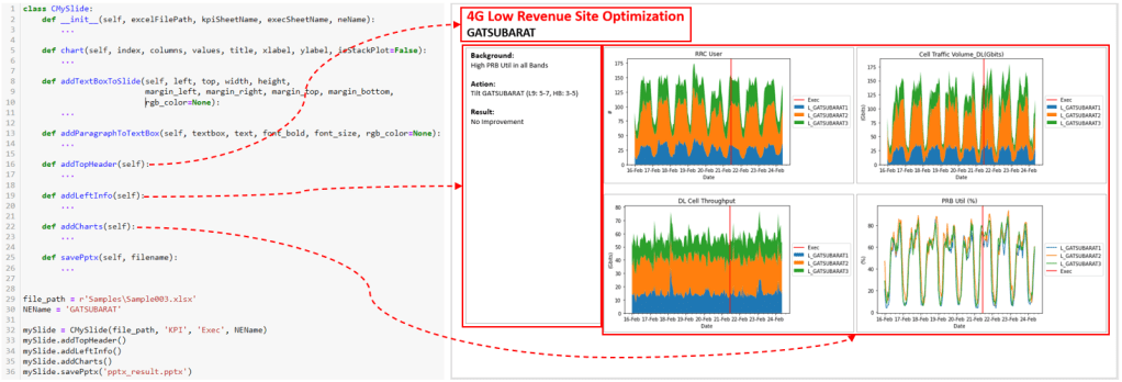
- addTopHeader(self): This function will add Text Box as a slide header and put some information.
- addLeftInfo(self): This function will add Text Box on the left side of the slide and put some information.
- addCharts(self): This function will add 4 charts to the right of the slide content.
- savePptx(self, filename): This function will save PowerPoint presentation to file (.pptx).
Testing
On this test, we’ll try to load Excel Data (sample data, here) and process the data in chart and information terms, update it to PowerPoint slide, and save the file (.pptx). Here is the code:
file_path = r'Sample003.xlsx'
NEName = 'GATSUBARAT'

mySlide = CMySlide(file_path, 'KPI', 'Exec', NEName)
mySlide.addTopHeader()
mySlide.addLeftInfo()
mySlide.addCharts()
mySlide.savePptx('pptx_result.pptx')
Conclusion
We combine some classes from the previous posts to support our project to create a PowerPoint presentation from Excel Data. And in this project, we wrap all the steps to a class so the code is more readable and easier to organize (and don’t forget you must modify this class to accommodate your requirement).
