
In this post, you will learn how to use Pandas, Matplotlib, and BytesIO to visualize the data from an Excel file. The step we need is below:
- Read Excel file with Pandas. In this part, you can use CReadExcel or (CExcelFile & CSheet) classes from the previous post “How to read excel (xls, xlsx) file in python using pandas”
- Pivot Pandas’ DataFrame. In this part, we’ll create CPivot class to pivot Pandas DataFrame
- Plot Pandas’ DataFrame with Matplotlib. And in this part, we’ll create CChart class to show the chart and save it to an image file (png) or BytesIO
For all modules above (Pandas, Numpy & Matplotlib) must be installed in your environment (conda / virtual / local environment), for detail how to install in your virtual environment you can read at another post “Convert Jupyter file (.ipynb) to Python file (.py) and Python file (.py) to executable file (.exe)”. If in your environment you didn’t find the modules above so you must install them with the below command:
pip install pandas
pip install matplotlib
Step 1. Loading Data Set
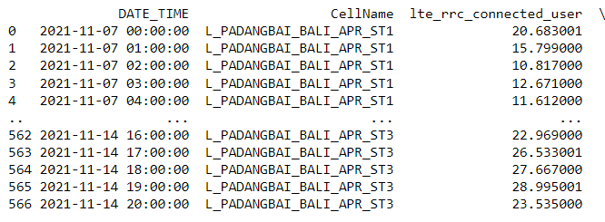
To load the data, we will be using CExcelFile class from the previous post, please read here. And the Excel sheet sample containing 3 columns (DATE_TIME, CellName, and lte_rrc_connected_user) as the picture below, or you can download the file from this link:

Now, the loading of data is done with the help of the code statement mentioned below:
file_path = r"Samples\Sample001.xlsx"
excel = CExcelFile(file_path)
mycomm = excel.sheet('MyComm')

print(mycomm.dataframe)
The script above tells us: Read Excel file and save it to excel variable as a data frame and read “MyComm” Excel Sheet and save it to mycomm variable and display the MyComm-Excel-Sheet data frame:
Step 2. Create Pivot Class
Below is the code to pivot Pandas DataFrame:
import numpy as np

class CPivot:
    def __init__(self, dataframe):
        self.dataframe = dataframe

    def sum(self, index, columns, values):
        return pd.pivot_table(self.dataframe, index=index, columns=columns, values=values, aggfunc=np.sum)
In this post, we only add pivot sum just to tell you the concept thoroughly, but you can try out to add a different pivot type.
Let’s test it:
import numpy as np

class CPivot:
    def __init__(self, dataframe):
        self.dataframe = dataframe

    def sum(self, index, columns, values):
        return pd.pivot_table(self.dataframe, index=index, columns=columns, values=values, aggfunc=np.sum)


file_path = r"Samples\Sample001.xlsx"
excel = CExcelFile(file_path)
mycomm = excel.sheet('MyComm')
mycomm_pivot_sum = CPivot(mycomm.dataframe).sum(index='DATE_TIME', columns='CellName', values='lte_rrc_connected_user')

print(mycomm_pivot_sum)
The output:

Step 3. Create Chart Class
For simplification, we’ll use matplotlib.pyplot.subplots default value (nrows=1 and ncols=1), but if you want to deep dive then better to see the matplotlib.pyplot.subplots method from the source code and from the document.
Here is the code:
import matplotlib.pyplot as plt
from io import BytesIO

import matplotlib.dates as mdates

class CChart:
    def __init__(self, dataframe, figsize=None): #nrows=1, ncols=1, gridspec_kw=None):
        self.dataframe = dataframe
        self.fig, self.ax = plt.subplots(figsize=figsize)
        #self.fig, self.ax = plt.subplots(nrows=nrows, ncols=ncols, gridspec_kw=gridspec_kw)

    def setLabels(self, title='', xlabel='', ylabel=''):
        self.ax.set_title(title)
        self.ax.set_xlabel(xlabel)
        self.ax.set_ylabel(ylabel)

    def xAxisFormatter(self):
        hour_locator = mdates.HourLocator(interval=6)
        self.ax.xaxis.set_major_formatter(mdates.DateFormatter('%d-%b'))
        self.ax.xaxis.set_minor_locator(hour_locator)

    def linePlot(self):
        labels = self.dataframe.columns
        for label in labels:
            plt.plot(self.dataframe.index, self.dataframe[label], label=label)

    def scatterPlot(self):
        labels = self.dataframe.columns
        for label in labels:
            plt.plot(self.dataframe.index, self.dataframe[label], 'o', label=label)

    def execLine(self, exec_datatime, label='Exec', color='Red'):
        exec_x = [pd.to_datetime(exec_datatime), pd.to_datetime(exec_datatime)]
        y_min, y_max = self.ax.get_ylim()
        exec_y = [y_min, y_max]
        self.ax.set_ylim(y_min, y_max)
        plt.plot(exec_x, exec_y, label=label, color=color)

    def stackPlot(self):
        labels = self.dataframe.columns
        columns = [self.dataframe[label] for label in labels]
        plt.stackplot(self.dataframe.index, columns, labels=labels)

    def setLegend(self):
        self.ax.legend(loc="center left", bbox_to_anchor=(1, 0.5), ncol=1)
        #self.ax.legend(loc="lower center", bbox_to_anchor=(0.5, 0), ncol=9)
        #self.ax.legend(loc="lower center", bbox_to_anchor=(0.5, -0.3), ncol=9)

    def savefig(self, fname=''):
        plt.savefig(fname, bbox_inches='tight', format='png', tranparent=True)

    def getImageStream(self):
        imageStream = BytesIO()
        plt.savefig(imageStream, bbox_inches='tight', format='png', tranparent=True)
        return imageStream
Code explanation:
- __init__: Constructor method will wrap Pivot DataFrame and figure size for the subplot
- setLabels: This method will set the x/y labels and title of the chart
- xAxisFormatter: This method will format x axis and you can modify it as your need
- linePlot: This method will create line chart from the pivot DataFrame
- scatterPlot: This method will create scatter chart from the pivot DataFrame
- execLine: This method is to plot red-vertical-line on the chart to show a timeline. We use get_ylim method to get minimum and maximum y axis value so the execLine will fit in chart area.
- stackPlot: This method will create stack chart from the pivot DataFrame
- setLegend: This method will set the legend location in your chart area
- savefig: This method will save the figure to png file
- getImageStream: This method will return BytesIO and you can still save it to picture file like png file later or you can use it like copy/paste to pptx file.
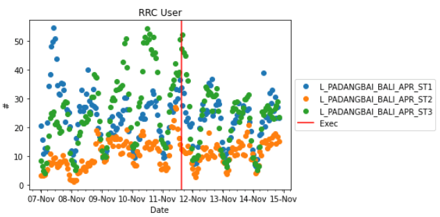
Sample 1, simply set figsize, plot the chart and save the plot as png file:
file_path = r"Samples\Sample001.xlsx"
excel = CExcelFile(file_path)
mycomm = excel.sheet('MyComm')
mycomm_pivot_sum = CPivot(mycomm.dataframe).sum(index='DATE_TIME', columns='CellName', values='lte_rrc_connected_user2')

chart1 = CChart(mycomm_pivot_sum, figsize=(10,2))
chart1.setLabels(title='RRC User', xlabel='Date', ylabel='#')
chart1.xAxisFormatter()
chart1.linePlot()
chart1.execLine('2021-11-11 15:00:00')
chart1.setLegend()

chart1.savefig('chart1.png')
The output:

Sample 2, create scatter plot with default figsize:
file_path = r"Samples\Sample001.xlsx"
excel = CExcelFile(file_path)
mycomm = excel.sheet('MyComm')
mycomm_pivot_sum = CPivot(mycomm.dataframe).sum(index='DATE_TIME', columns='CellName', values='lte_rrc_connected_user2')

chart2 = CChart(mycomm_pivot_sum)
chart2.setLabels(title='RRC User', xlabel='Date', ylabel='#')
chart2.xAxisFormatter()
chart2.scatterPlot()
chart2.execLine('2021-11-11 15:00:00')
chart2.setLegend()
The output:
Sample 3, create stack plot and save it as BytesIO and then save again to png file:
file_path = r"Samples\Sample001.xlsx"
excel = CExcelFile(file_path)
mycomm = excel.sheet('MyComm')
mycomm_pivot_sum = CPivot(mycomm.dataframe).sum(index='DATE_TIME', columns='CellName', values='lte_rrc_connected_user2')

chart3 = CChart(mycomm_pivot_sum)
chart3.setLabels(title='PRB Utilization (%)', xlabel='Date', ylabel='#')
chart3.xAxisFormatter()
chart3.stackPlot()
chart3.execLine('2021-11-11 15:00:00')
chart3.setLegend()
chart3_ios = chart3.getImageStream()

with open("chart3.png", "wb") as outfile:
    # Copy the BytesIO stream to the output file
    outfile.write(chart3_ios.getbuffer())
The output:

Conclusion
That’s it, now you know how to load a dataset from Excel file to Pandas DataFrame, Pivoting Pandas DataFrame, and Plot it or save it to png or BytesIO (for later use). You can modify the code as your need and hope you understood the concept and the flow thoroughly and will be able to implement the same for yourself.
